

Table of Contents
- The Real Question Behind the 'Preachy' Label
- Why Some Faith Based Clothing Misses the Mark
- Minimalist Faith Based Apparel: The Quiet Alternative
- How to Style Oversized Faith Hoodies Without the Cringe
- Context Matters: Dressing for the Room You're In
- Evaluating the Best Unisex Faith Inspired Streetwear Brands
- Wear Your Values With Intention, Not Volume
- Frequently Asked Questions
Last Updated: September 6, 2026
The question "is faith based clothing too preachy?" has become a flashpoint in streetwear culture, and the answer is nuanced. The distinction between bold witness and wearable billboard comes down to design intentionality rather than the message itself. Faith based clothing isn't inherently preachy, but poorly executed designs with cheesy slogans absolutely can be. This guide breaks down what separates authentic expression from cringey noise.
The real tension isn't about faith itself but how visual communication works in public spaces. When a design prioritizes shock value over aesthetics, the message gets lost in the noise.
The Real Question Behind the 'Preachy' Label
The "preachy" label sticks when the wearer's intent appears to be proselytizing rather than personal expression. Psychologically, people bristle at clothing that feels like an ambush, a sermon delivered without invitation (apa.org). This is the core of the cringe factor dominating social media discourse.
What most guides miss is that the objection isn't usually to the Gospel message itself but to the delivery mechanism. A shirt that screams scripture at strangers makes the observer feel cornered rather than engaged.
Authenticity changes everything. When fashion choices reflect an internal reality rather than an outward display designed to convert, people respond differently. The same message delivered with humility reads as confident; delivered with aggression, it reads as insecurity.
Why Some Faith Based Clothing Misses the Mark
Most commentary on 'cringey' faith apparel stops at subjective taste, 'it just feels off.' But the cringe reaction isn't random; it's a predictable response to specific, identifiable design failures. Understanding the mechanics lets you avoid them.
The Typography Trap
The fastest way to trigger a cringe response is typography that screams 'clip art' rather than 'design.' Three font sins dominate the market:
- Default script fonts: Fonts like Brush Script or Lucida Handwriting, when used for words like 'Beloved' or 'Redeemed,' read as a last-minute print-on-demand decision, not a deliberate aesthetic choice. They carry the visual weight of a 2005 church newsletter.
- All-caps gothic or blackletter: While gothic type has historical gravitas, its overuse on faith apparel, especially paired with aggressive phrasing, signals a hardline stance before a single word is processed. It creates visual distance rather than invitation.
- Mixed font families: Pairing a serif with a sans-serif can work, but pairing three or more distinct typefaces on one garment creates visual noise. The eye doesn't know where to land, and the message gets lost in the chaos.
The fix is restraint. A single, well-chosen typeface, a clean sans-serif like Helvetica Neue or a refined serif like Garamond, in a controlled weight and size signals a deliberate choice, not a default.
The Color Theory Problem
Color operates on the subconscious before the brain processes a single word. High-saturation, high-contrast combinations, electric yellow on black or neon orange on white, trigger the same 'look at me' alarm as a car dealership banner (peer-reviewed research). They demand attention rather than earn it.
Conversely, tonal palettes, cream on oatmeal, charcoal on heather gray, deep forest green on black, create depth and sophistication, making the message part of the garment's texture. This is why muted earth tones and washed-out pastels dominate minimalist faith apparel: they lower the observer's defensive posture before the message registers.
The Placement Fallacy
Where a message sits changes how it's received. A full-front, chest-level graphic spanning from collarbone to sternum is the visual equivalent of shouting across a room, forcing engagement.
Placement that works better:
- Small chest logos (2-3 inches wide) at the left breast or center chest read as a brand mark, not a sermon.
- Back-of-neck or hem embroidery rewards those who get close enough to notice, creating intimacy rather than confrontation.
- Sleeve graphics on a dropped shoulder or raglan sleeve feel editorial and fashion-forward, especially when the graphic is tonal or monochromatic.
The Fabric and Print Quality Signal
Even a well-designed graphic fails if the garment feels cheap. A thin, boxy tee with a stiff plastisol transfer that cracks after three washes signals the message is disposable. Premium materials, heavyweight cotton (240 GSM or higher), soft-hand inks, or puff-print textures, tell a different story: this message is worth investing in (textiles.ncsu.edu).
The cringe factor, then, isn't about faith at all but the gap between intention and execution. When a design fails on typography, color, placement, or material, the observer sees carelessness, not conviction. Carelessness triggers the recoil, not the cross or scripture reference.
The 'preachy' label is often a design critique in disguise. Fix the design principles, and the message gets a fair hearing.
Minimalist Faith Based Apparel: The Quiet Alternative
Minimalist faith based apparel solves the preachy problem by trusting the observer to lean in rather than recoil. The philosophy centers on subtle elements: small chest logos, tonal embroidery, and thoughtful negative space.
Consider a hoodie reading "REPENT NOW" in eight-inch letters versus one with a small, refined cross stitched at the hem. Both communicate faith; only one invites curiosity. The quiet version creates a gap the observer must fill, and that gap is where authentic conversation begins.
Typography does heavy lifting here. A single word like "Grace" or "Redeemed" in elegant, understated lettering carries more cultural relevance than a paragraph of scripture, hinting at a story without demanding engagement.
This approach respects the observer's autonomy, saying "This matters to me" rather than "This should matter to you." For the spiritual but not religious crowd, this distinction is everything, they're open to seeing faith lived out, not having it imposed.
How to Style Oversized Faith Hoodies Without the Cringe
Styling an oversized faith hoodie well is about letting the garment live as fashion first and statement second, a look that feels natural, not costumed.
Start with fit. An oversized hoodie should drape cleanly off the shoulders with sleeves bunching slightly at the wrist. Pair it with tapered joggers or slim jeans to balance the volume, add clean white sneakers, and you have a silhouette that works in any casual setting.
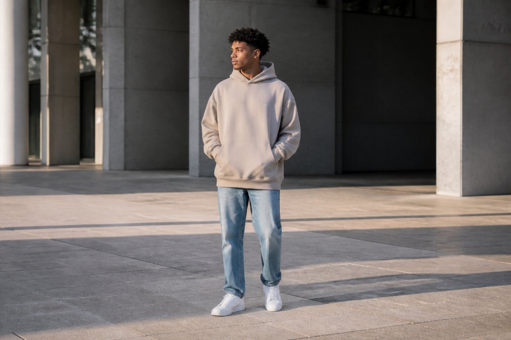
Layering changes the energy completely. An open flannel or cropped jacket over the hoodie makes the message a detail rather than the main event, signaling that your faith is part of who you are, not the only thing you are.
Color choice matters more than people realize. Neutral tones like heather gray, oatmeal, and washed black read as sophisticated and approachable. Neon or high-contrast colorways amplify the "look at me" energy that triggers the cringe response.
The styling principle is simple: the outfit should look chosen for comfort and aesthetics first. When someone compliments the hoodie and then notices the message, you've won; when they notice the message first, you've lost the plot.
Context Matters: Dressing for the Room You're In
The 'preachy' label is rarely about the message itself, it's about whether the message fits the room. A bold piece that sparks a 20-minute conversation at a college fellowship will create awkward silence at a job interview. Neither context is wrong; the mismatch is the problem.
The Context Spectrum
Think of your wardrobe as a volume dial, not an on/off switch. Different environments call for different visual volumes:
High-volume contexts (bold messaging works):
- Church services and campus ministry events where the shared language of faith is assumed
- Christian music festivals or conferences where attendees expect and welcome explicit messaging
- Small-group gatherings or Bible studies where the people around you already know your story
Medium-volume contexts (subtle or symbolic messaging works):
- Casual social settings like coffee shops, gyms, or weekend errands where strangers may see you but aren't in a formal power dynamic with you
- Family gatherings where some members share your faith and others don't, a small cross or a tonal 'Grace' script opens doors without forcing a conversation
- Creative or artistic spaces (galleries, open mics, design studios) where self-expression is valued but nuance is respected
Low-volume contexts (minimal or no visible messaging):
- Professional workplaces, especially in corporate, legal, healthcare, or educational settings where neutrality is expected
- Client-facing roles where the person across the table may hold different beliefs and the priority is building trust on shared professional ground
- Formal events like weddings, funerals, or milestone celebrations where the focus belongs on the occasion, not your wardrobe
The 'First Impression' Rule
A practical heuristic: if you're entering a space where a first impression matters for your livelihood or relationships, default to low or medium volume. The person who meets you at a job interview doesn't have the context to interpret 'John 3:16' across your chest as anything other than a statement about them. They don't know your heart; they only see the signal.
This isn't about hiding your faith but recognizing that clothing is a pre-verbal communication channel. In low-context environments, a bold faith message can read as a demand for agreement rather than an invitation to curiosity. The subtler piece, a small embroidered cross at the hem, a tonal 'Redeemed' on a cap, plants a question without forcing a position.
The 'Two-Wardrobe' Strategy
Most people who wear faith-based clothing well maintain two distinct closet categories:
- Community pieces: Bold, explicit, conversation-starting designs meant for spaces where faith is the shared language. These are the pieces that say 'I'm one of you' to fellow believers.
- Ambassador pieces: Understated, design-forward staples meant for the broader world. These say 'I have something that matters to me' without demanding the observer engage.
The mistake is wearing a community piece into an ambassador context. That mismatch, not the faith itself, is what creates the perception of pushiness.
Reading the Room in Real Time
Context isn't static. A coffee shop at 8 AM on a Tuesday is a different room than the same shop at 8 PM on a Friday. Pay attention to the visual volume of those around you; if you're the only person wearing text-based messaging, you're probably turned up too loud.
A useful test: before leaving the house, ask yourself, 'If someone who knows nothing about me saw this garment, what would they assume?' If the answer is 'that I'm trying to convert them,' dial it back. If it's 'that I have a faith that shapes my life,' you're in the right range.
Evaluating the Best Unisex Faith Inspired Streetwear Brands
When evaluating the best unisex faith inspired streetwear brands, look for intentionality in three areas: design process, material quality, and brand messaging. A brand treating faith as a marketing gimmick produces apparel that feels like a costume; one genuinely invested in the community produces pieces that feel like armor.
The best unisex faith inspired streetwear brands share common traits: premium heavyweight fabrics that hold their shape, designs showing restraint, and a brand voice reflecting humility rather than superiority.
Attitudz Apparel offers a curated collection of faith-inspired streetwear that blends premium heavyweight hoodies, oversized tees, and fleece pullovers with purpose-driven messaging. Every piece is designed to help you wear your values with confidence, whether you're making a bold statement or keeping it subtle with a minimalist essential.
Material quality is the unspoken credibility signal. A hoodie that feels substantial and survives repeated washes tells the world you take yourself seriously. Thin, scratchy fabric with peeling print undermines even the most sincere message.
Wear Your Values With Intention, Not Volume
The answer to whether faith based clothing is too preachy ultimately rests with the wearer and designer. When created with design intentionality, premium materials, and an understanding of visual communication, it becomes a powerful tool for connection rather than division.
The cultural moment favors this approach. Young believers are tired of cheap, cringey slogans that invite mockery; they want pieces reflecting their faith identity with the same sophistication they demand from the rest of their wardrobe. The brands winning this space treat faith apparel as serious design work, not novelty merchandise.
Your clothing is always communicating something. The question is whether it's communicating the depth of your convictions or just the volume of your noise. Choose pieces that let your life do the talking, with your clothing as a quiet but confident companion to the story you're already telling.
Frequently Asked Questions
What makes some Christian apparel feel 'cringey' or 'preachy'?
It usually comes down to design and tone. Apparel feels preachy when the message is loud, the typography is aggressive, or the slogan tries to lecture the viewer. 'Cringey' often results from a forced vibe, where the design prioritizes a cliché phrase over aesthetics. Modern, faith-based clothing avoids this by using subtle design elements, thoughtful typography, and messages that reflect personal conviction rather than a public lecture. The goal is to start a conversation, not end one.
How can you style faith-inspired clothing for a modern look?
Treat the faith-based piece as the focal point of a simple outfit. For an oversized faith hoodie, pair it with slim-fit jeans or joggers and clean sneakers to balance the proportions. Layering a minimalist tee under an open flannel or jacket adds depth without looking busy. The key is intentionality: let the garment's message speak through its design, not through competing patterns or overly loud accessories. This approach keeps the look current and the message clear.
Is it possible to wear faith-based apparel in professional settings?
Yes, when you choose minimalist faith based apparel. A simple, well-made piece with a small logo or a subtle design on the chest works in casual office environments. Save bold statements for off-hours. The fabric quality and fit matter most; a premium heavyweight hoodie in a neutral color reads as intentional and professional, while a faded shirt with a large graphic does not. Contextual appropriateness is key to making faith-based clothing feel respectful, not forceful.
What is the difference between 'preachy' apparel and purpose-driven streetwear?
The difference lies in the intent and execution. 'Preachy' apparel often uses loud, direct language that tells the viewer what to believe, which can feel like proselytizing. Purpose-driven streetwear uses modern design aesthetics and quality materials to express a personal faith journey. The message is an invitation for connection, not a demand for agreement, making it more about authenticity than outward display.
Wearing your faith shouldn't feel like wearing a target on your back. Attitudz Apparel crafts premium, unisex faith-inspired streetwear designed to express your beliefs with confidence and style, not awkwardness. Every heavyweight hoodie and oversized tee is built for real life, with free shipping on all U.S. orders and quality that holds up wash after wash. Get started with Attitudz Apparel and wear your values without the cringe.